What Are the International Colour Trends for 2026?
Colour doesn't just decorate a space. It defines how that space feels to live in.
From the runways of Paris to the living rooms of South Dorset — colour in 2026 is sending a very clear message.
The Big Picture — A World Reaching for Balance
Every year, a handful of global institutions dedicate thousands of research hours to a single question: what colour comes next? The answers they arrive at are never arbitrary. Colour forecasting draws on signals from culture, economics, psychology, politics, and design - and the collective picture for 2026 is striking in its coherence.
The overarching theme? Contrasts held in careful balance. On one side, a deep collective longing for calm, rootedness, and simplicity. On the other, a countervailing energy - bold, expressive, and optimistic. The palette for 2026 doesn’t ask you to choose between these two impulses. It holds them in tension, and that tension is precisely where the interest lies.
For homeowners and renovators, this is a genuinely useful moment. The colour choices being made on international runways and in global design studios filter down into interiors, as they always do. Understanding where the trends are heading gives you a head start - and it helps you make choices you’ll still feel good about in five years’ time.
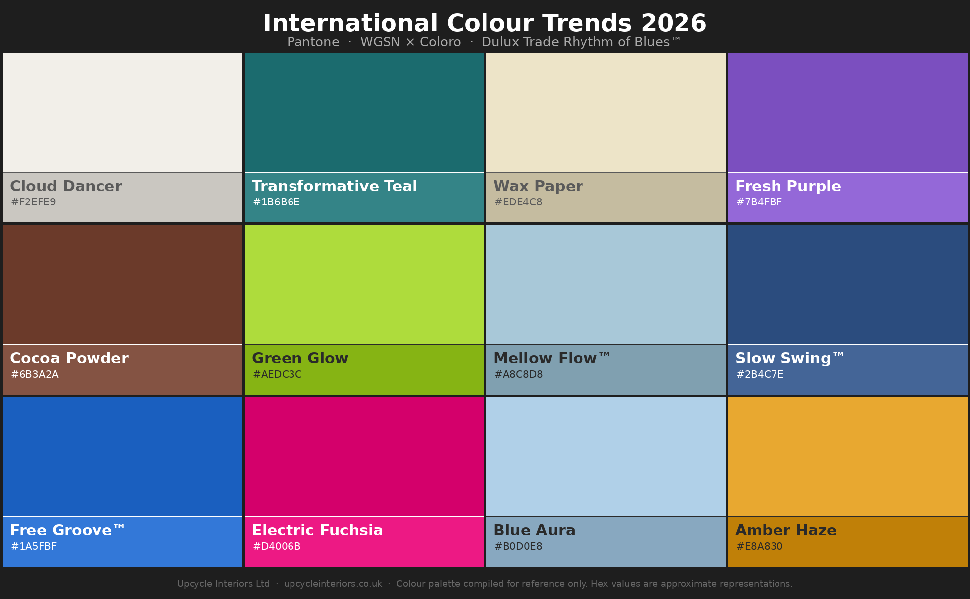
Four of the world’s most influential colour authorities have weighed in for 2026: Pantone, WGSN in partnership with Coloro, and Dulux Trade, whose research is conducted at the AkzoNobel Global Aesthetic Centre in consultation with international design professionals. Each is approaching the year from a slightly different angle, but the threads connecting their conclusions are hard to miss.
Pantone’s Colour of the Year — Cloud Dancer
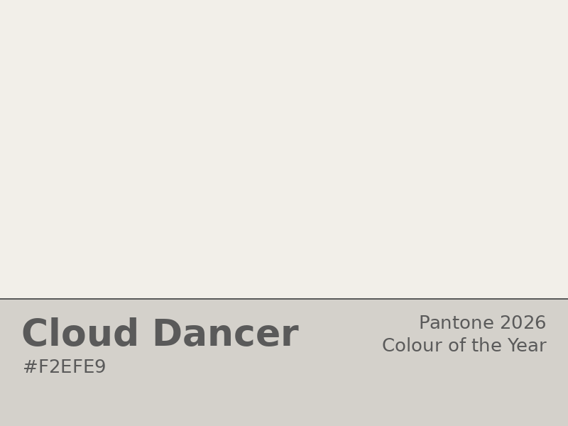
The world’s most-watched colour authority, Pantone, has chosen Cloud Dancer (PANTONE 11-4201) as its Colour of the Year for 2026. It’s an off-white — soft, slightly warm, suspended somewhere between cool and neutral. On the surface, it might seem like an understated choice. But the reasoning behind it is worth understanding.
Pantone describes Cloud Dancer as a fresh canvas: a colour that fosters creativity and reflects a cultural moment defined by noise and overstimulation. In a world that rarely stops moving, an airy, undemanding off-white represents something many of us quietly crave — breathing room. Minimalism, simplicity, and the desire for a slower pace are themes that run through the choice.
For interiors, the implications are immediate and practical. Cloud Dancer as a wall colour creates a backdrop that works with almost anything placed in front of it. It doesn’t compete with furniture, art, or architectural detail. It amplifies them. In period properties especially — the kind of work UIL carries out across Weymouth, Dorchester, and South Dorset — an intelligent off-white on original plasterwork, dado rails, or timber panelling can be genuinely transformative. It honours the character of a space without freezing it in time.
A well-chosen white doesn’t erase a room’s character. It reveals it.
WGSN & Coloro — Transformative Teal
While Pantone has chosen restraint, the global trend authority WGSN — working with colour system specialists Coloro — has taken a bolder position. Their Colour of the Year for 2026 is Transformative Teal: a deep, fluid blend of classic dark blue and aqua green.
The name is deliberate. WGSN are describing 2026 as a year of redirection and challenge — a moment when established ways of thinking are being questioned and new approaches are gaining ground. Transformative Teal sits at the intersection of the familiar and the forward-looking: blue’s depth and trustworthiness fused with green’s freshness and its deep connection to the natural world. The themes WGSN associate with it — sustainability, regeneration, inner balance — reflect values that are increasingly central to how people think about their homes as well as their wardrobes.
In fashion, Transformative Teal is positioned as a gender-inclusive alternative dark — capable of anchoring a look the way navy or charcoal traditionally would, but with considerably more personality. For interiors the same logic applies. It works as a deep, considered choice for a feature wall, kitchen cabinetry, or bespoke joinery — grounded enough not to feel like a passing trend, distinctive enough to make a real statement. The ethos of reclaimed materials and period property preservation that sits at the heart of the UIL approach also chimes well with the sustainability themes this colour carries.
Dulux Trade — The Rhythm of Blues™
Dulux Trade, whose colour research is conducted at the AkzoNobel Global Aesthetic Centre through consultation with design professionals around the world, has taken a distinctly different approach to the year. Rather than a single Colour of the Year, their 2026 selection presents three tones — a trio designed to capture the full emotional range of blue.
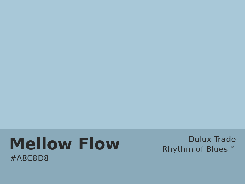
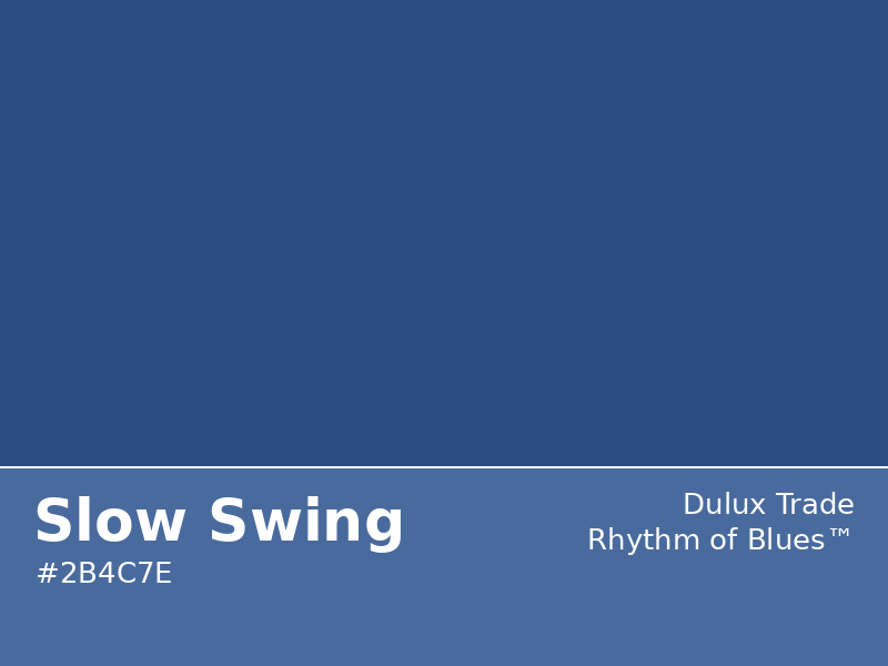
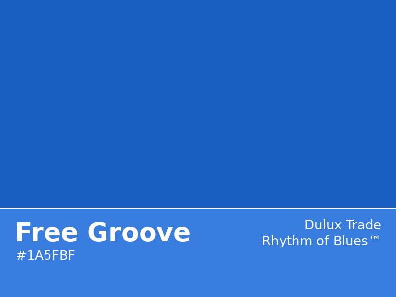
The collection is called the Rhythm of Blues™, and the three colours it contains are Mellow Flow™, Slow Swing™, and Free Groove™. Each is designed to deliver a specific emotional outcome, and together they make the case that blue isn’t one thing. It’s a spectrum.
Mellow Flow™ is the lightest of the three — an airy sky blue that evokes soothing springs and sunrise skies. It’s a colour with timeless, calming qualities: the kind of shade that makes a room feel like it’s breathing. Slow Swing™ goes deeper and darker — a meditative indigo that grounds a space and quietens the mind. Think of the deep ocean’s stillness, or the particular quality of light just before dusk. Free Groove™ moves in the opposite direction entirely: a vibrant cobalt that brings energy, excitement, and a forward-looking optimism. The heat of a summer afternoon, or the colour of a swimming pool at the height of the season.
The Rhythm of Blues™ collection also comes with three complementary interior palettes, each built around one of these core tones and designed to reflect a specific mood.
“Blue has been the world’s favourite colour for years, but it’s far from one note.”
The Slow Colour Story pairs the meditative depth of Slow Swing™ with natural browns and wintery earth tones — a combination that creates calm, restorative spaces. This palette works particularly well in rooms where people need respite from noise and pressure: bedrooms, reading rooms, home offices. The kind of spaces that should feel like a retreat.
The Flow Colour Story takes Mellow Flow™ as its anchor and pairs it with the warmth of terracotta, brick, and clay. These are familiar, natural tones that create spaces where people want to come together. They work beautifully in kitchens, dining rooms, and open living areas — rooms that need to feel inviting, warm, and genuinely habitable rather than merely designed.
The Free Colour Story is the most expressive of the three. Free Groove™ cobalt provides the grounding blue note, while a broader, more eclectic palette of multicolours creates something youthful, energetic, and unapologetically fun. This is a palette for spaces where creativity and stimulation are the goal — studios, playrooms, or any room that could do with a jolt of forward momentum.
It’s worth noting that Dulux Trade has also developed exterior versions of each of these three palettes, recognising that the themes running through 2026’s colour direction are just as relevant outside as they are in.
Five Key Colours for Autumn/Winter 26/27
WGSN and Coloro have identified five key colours for the Autumn/Winter 2026/27 season. Each tells a different story, and together they map the emotional terrain of the year ahead. Transformative Teal anchors the selection — but the four colours alongside it reveal just how wide the range is.
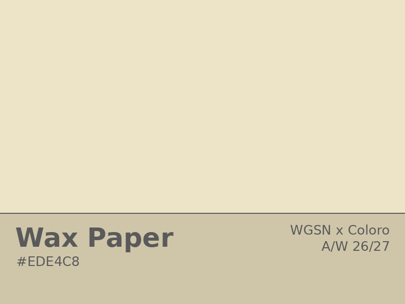
Wax Paper — a creamy near-neutral off-white with warm yellow undertones. Where Pantone’s Cloud Dancer is airy and cool, Wax Paper is a warmer, cosier proposition — evoking diluted winter sun and the glow of natural fibres. Forecasters associate it with healing, sustainability, and a return to natural materials. Designed for enhanced neutrals and minimalist schemes, it appeals across all age groups and works particularly well in north-facing rooms that need warmth without weight. On a matte limewash or a period plaster wall, it’s quietly spectacular.
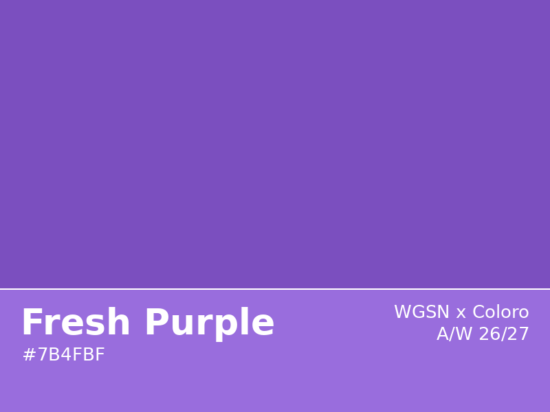
Fresh Purple — an electric, culturally emotive shade with deep links to royalty, mystery, creativity, and — perhaps unexpectedly — the digital world. WGSN frame it as a colour with a fresh start: familiar territory viewed from a new angle. It carries a phygital energy that connects the physical and virtual, and in interior terms it functions best as an accent rather than a base. A painted alcove, a restored period door, a section of bespoke joinery — these are the places where Fresh Purple earns its keep without overwhelming a scheme.
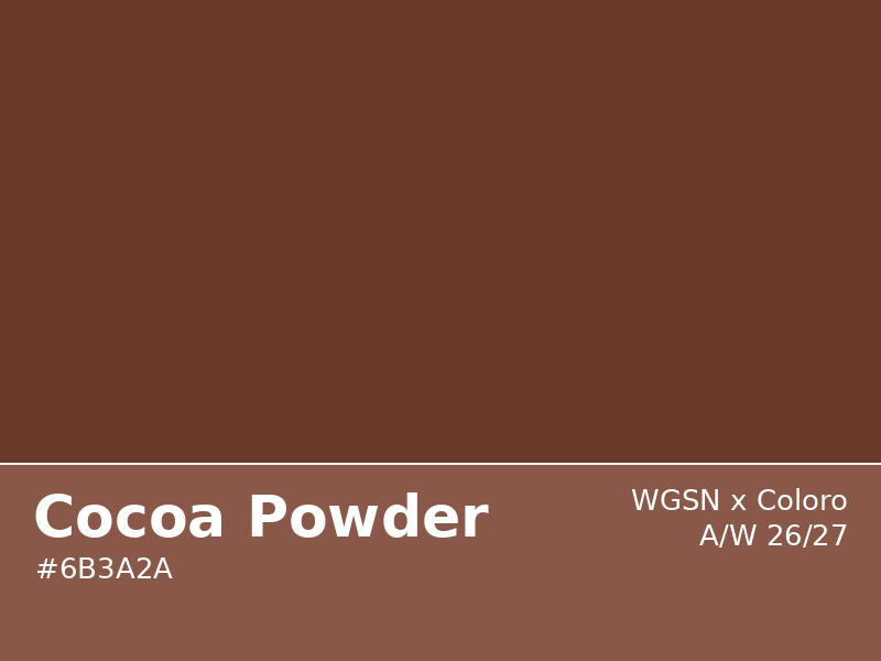
Cocoa Powder — a warm, red-toned brown that carries strong associations with craft, nostalgia, and the handmade. WGSN connect it to a cultural reaction against the relentless pace of technology — a craving for slowness, for materials found in nature, for the analogue over the digital. In interiors, Cocoa Powder is rich and deeply versatile. It works on walls in traditional or heritage spaces, on woodwork and joinery, in kitchens, and in combination with the other earthy tones that define the 2026 direction. As a statement brown for the season, it has a premiumisation quality that translates beautifully to hard materials and metallic finishes.
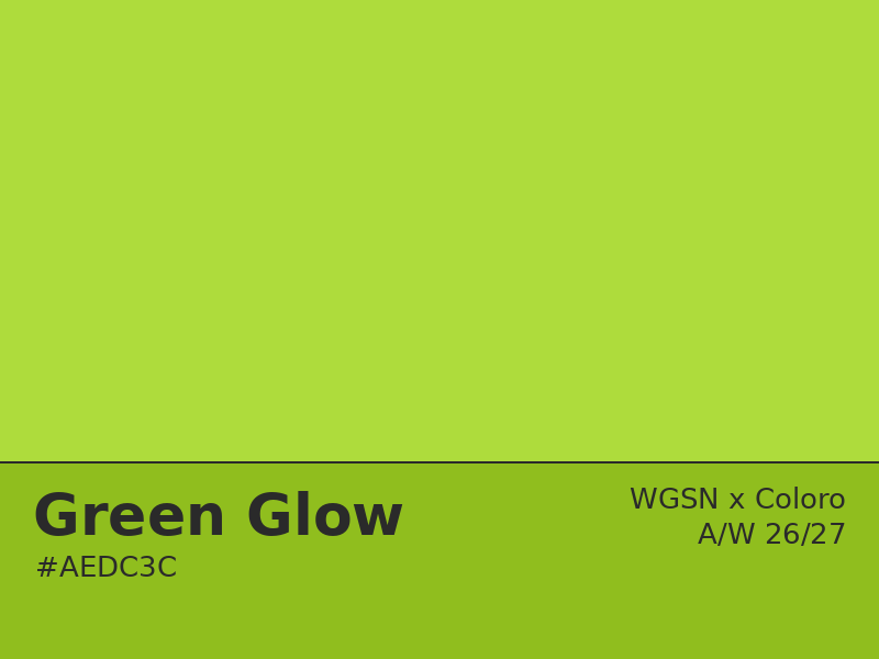
Green Glow — the wildcard of the season. Sitting between yellow and green, this is a high-energy, neon-adjacent shade that WGSN associate with nocturnal living, escapism, and a youthful sense of creative momentum. It is not a colour for every room or every client — but as a deliberate accent in the right context, it has the power to energise a space like few other colours can. A utility room, an interior reveal, a piece of bespoke joinery in an otherwise neutral scheme: used with restraint and intention, Green Glow is a genuinely exciting choice.
What the Runways Are Telling Us
Colour trends typically arrive in interiors a season or two after fashion, which means the runways of late 2025 and early 2026 are an advance preview of where home colour is heading. The picture from the major fashion weeks is layered and revealing.
New York Fashion Week’s Spring/Summer 2026 palette combined vibrant accent colours — a bold teal-blue-green, a dramatic warm red, a vivid yellow-green — with clean, season-spanning neutrals. Pantone associated the selection with themes of honesty, authenticity, and the desire to express one’s own identity without apology. A palette that knows what it is.
London’s offering was more playful: smoky mauves, soft banana yellows, pastel pinks, and warm caramels alongside bolder statement shades including a luxurious deep purple and warm mandarin orange. Modernised classics with a light touch — which is, when you think about it, a fair description of what a well-executed period property renovation aspires to achieve.
For the Autumn/Winter season, the mood shifted decisively. Earthy warmth — cocoa browns, warm off-whites, deep teals — combined with a sense of restrained luxury. Soft, flowing fabrics, matte surfaces, and gently textured finishes reinforce the palette. The colour doesn’t shout. It settles. Calm, considered, and genuinely premium.
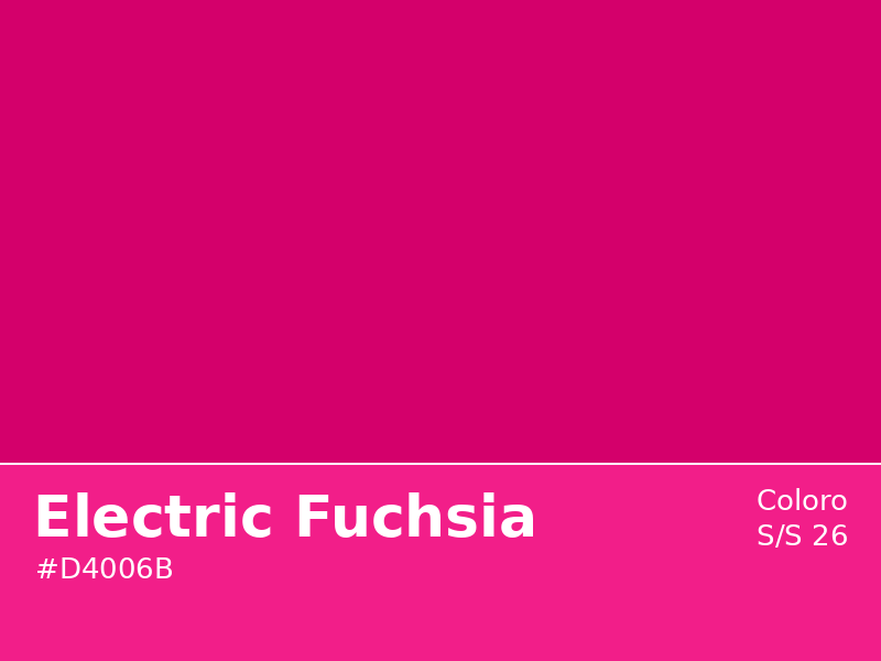
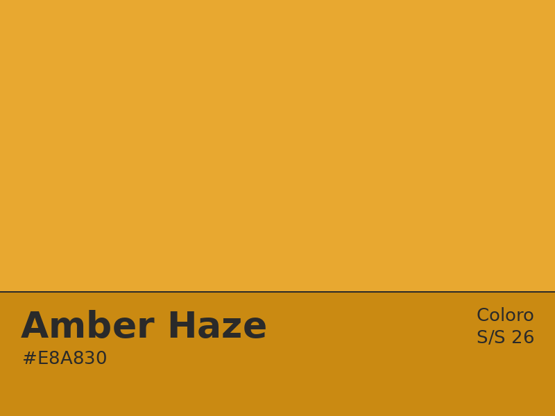
The Spring/Summer picture is where the energy lives. Pantone’s seasonal top ten includes smoky lavenders, bold reds, intense teal greens, bright fruity oranges, deep cosmopolitan purples, and warm rusty browns — an expressive, emotionally rich palette that moves fluidly between softness and strength. Coloro’s seasonal additions reinforce this: Electric Fuchsia (bright, optimistic, deeply confident), Blue Aura (a soft soothing light blue that conveys trust and lightness), and Amber Haze (a warm golden yellow that brings life to tired schemes and north-facing rooms alike).

The consistent thread across all of this is the pairing of earthy, grounding foundations with carefully chosen expressive accents. Neither dominates the other. Both earn their place. It’s an approach that translates directly and naturally into how we think about interior colour at UIL.
What This Means for Your Home in 2026
Taken together, the 2026 trend landscape — across all four authorities — supports some clear and practical principles for anyone planning a renovation, a room refresh, or simply a new approach to colour in their home.
Ground it first. The dominant direction across every major forecaster is towards earthy, natural, grounding shades as the foundation of a scheme. Warm off-whites like Cloud Dancer or Wax Paper, rich cocoa browns, soft greens, and deep teals provide the base. These are colours with genuine longevity. Chosen thoughtfully, they’ll still feel right in 2030.
Accent with intention. The season’s energy comes from contrast. A single well-chosen accent — a painted alcove in Fresh Purple, kitchen cabinetry in Transformative Teal, original skirting boards picked out in Cocoa Powder, or a burst of Free Groove™ cobalt on a piece of bespoke joinery — can completely reframe a room without dominating it. The accent earns its impact precisely because the rest of the scheme is calm.
Respect the architecture. This is especially relevant in South Dorset, where the housing stock contains a significant proportion of period and heritage properties. The 2026 palette — with its consistent emphasis on craft, authenticity, natural materials, and a connection to the past — is unusually well-suited to older buildings. These colours honour existing character rather than overriding it.
Think in surfaces, not just paint. Every forecaster this year has emphasised texture and material alongside colour. The same Wax Paper reads entirely differently on a matte limewash finish, a gloss-painted door, or a bare plaster wall. Getting this right is part of what separates a genuinely considered interior from a well-intentioned one. When we work on a project at UIL, the finish is always part of the colour conversation.
Don’t be afraid of blue. Between the Rhythm of Blues™ collection and Transformative Teal’s position as WGSN’s global Colour of the Year, blue in all its forms is having a significant moment in 2026. From the meditative depth of a dark indigo to the energising clarity of a bright cobalt, it’s a family of colours that delivers calm, confidence, or creativity depending on how it’s used. If you’ve been considering a blue — in any room, in any shade — this is your year.
Whether you’re planning a complete structural renovation or simply reconsidering what a single room can be, the UIL team can help translate these broader trends into something that actually works in your specific space.
Trends pass. Good colour lasts.
Get In Touch
✨ Ready to bring your project to life? At Upcycle Interiors, we combine professionalism, trustworthiness, and reliability to deliver results you can count on.
Whether it’s a small repair or a full renovation, we’ll treat your home with the care and respect it deserves.
For fuss-free fixing and finishing, contact us on:
🌐 www.upcycleinteriors.co.uk/contact
📧 sales@upcycleinteriors.co.uk
📞 01305 584459
📍 Based in Weymouth and covering all of South Dorset including DT1, DT2 (part), DT3, DT4, DT5, DT6 (part). Please do get in touch if your area is not on the list.
Upcycle Interiors Limited — professional, trustworthy, reliable.
Fully insured | DBS checked | Written quotations | VAT No. 483072978 | Waste Carrier Licence CBDU400611 | AXA insured
References
1. Pantone — Colour of the Year 2026: Cloud Dancer (PANTONE 11-4201). Pantone Colour Institute.
2. WGSN x Coloro — Colour of the Year 2026: Transformative Teal.
3. WGSN x Coloro — Key Colours A/W 26/27. https://www.wgsn.com/en/blog/key-colours-w-26-27
4. Wunderlabel UK — Colour Trends 2026: Pantone, Coloro & Fashion Weeks. https://wunderlabel.com/en-gb/blog/p/colour-trends-2026-uk/
5. Pantone — Fashion Colour Trend Report, New York Fashion Week SS26. https://www.pantone.com/articles/fashion-color-trend-report/new-york-fashion-week-spring-summer-2026
6. Pantone — Colour Report, London Fashion Week SS26. https://www.chicstylecollective.com/colour-report/
7. Dulux Trade — Rhythm of Blues™ 2026 Colour of the Year. AkzoNobel / Dulux Trade. Source material provided by client.